At Sensible Financial, we get very excited about passive investing. Since we first opened our doors in 2002, we’ve recommended passive funds as the best option for clients interested in higher returns at lower risk. It was a pretty radical recommendation at the time.
Since our first financial plan, things have changed quite a bit in the investing world. In 2002, net cash flows strongly favored actively managed funds to passive funds. But every year since 2005, actively managed domestic stock funds have had net outflows while index funds have had net inflows. As of today, roughly 40% of all U.S. stock mutual fund assets are in passive funds. In 2000, that number was 12%! (Source: Investment Company Institute).
In this article I will review the performance history of active management versus index returns to see how both strategies have fared over the long-run. (If you’ve made it this far and are wondering “What about the monkeys?” it’s a reference to Burton Malkiel, who wrote in 1973 that “A blindfolded monkey throwing darts at a newspaper’s financial pages could select a portfolio that would do just as well as one carefully selected by experts.”)
The dataset
S&P Dow Jones Indices produces one of the most comprehensive sources for active management performance data. Its S&P Indices Versus Active (“SPIVA”) scorecard, available online for free at http://us.spindices.com/spiva/, plots the performance of active managers against their relevant benchmarks over various time periods. Sensible Financial has used this scorecard throughout our history to help clients understand some of the key advantages of passive approaches.
Here’s how the SPIVA scorecard works. S&P collects the performance data of thousands of actively managed funds. It then matches those funds to an appropriate benchmark. For a true apples-to-apples comparison you need to use the right benchmark, and there are literally hundreds of benchmarks to choose from. For example, you wouldn’t compare the annual performance of a small, yet oh so savory, stock like Buffalo Wild Wings (BWLD) to the S&P 500 – an index of the 500 largest U.S. companies that represents about 80% of the American stock market. Buffalo Wild Wings’ market capitalization (the value of a company equal to its total number of shares multiplied by its price) is about $2 billion, whereas the mean market capitalization for the S&P 500 is $43 billion. Instead, a more appropriate benchmark would be the S&P SmallCap 600 (a collection of 600 small capitalization U.S. stocks that meet certain criteria). Similarly, if a fund primarily invests in small stocks, the S&P SmallCap 600 benchmark would be a better choice than the S&P 500.
S&P’s methodology is a bit more nuanced than what I’ve described above. SPIVA scorecards also account for: survivorship bias (when funds with poor performance are liquidated or merged over time), style drift (when funds diverge from their initial investment strategy, e.g., from large companies to small ones) and double counting due to multiple share classes, among other factors.
In short, the SPIVA scorecard provides a comprehensive set of data that lets us compare active management performance against relevant benchmarks over long periods of time.
Returns by the numbers
Starting in 2016, S&P Dow Jones’ SPIVA U.S. Scorecard started reporting fifteen years of data. You can download the full report here. (Interestingly, this lines up closely with Sensible Financial’s fifteen-year anniversary). For the first time, we’re able to view detailed U.S. active manager performance relative to their benchmarks over a fifteen-year timeframe. That period includes a lot, such as The Great Recession, the collapse of Enron, the War on Terror and Bernie Madoff. There have been bull markets and bear markets, high interest rates and record lows. In sum, there have been lots of high impact market events and different market cycles. The conclusions from such a long time period should be significant.
Here are some of the conclusions, taken directly from the report:
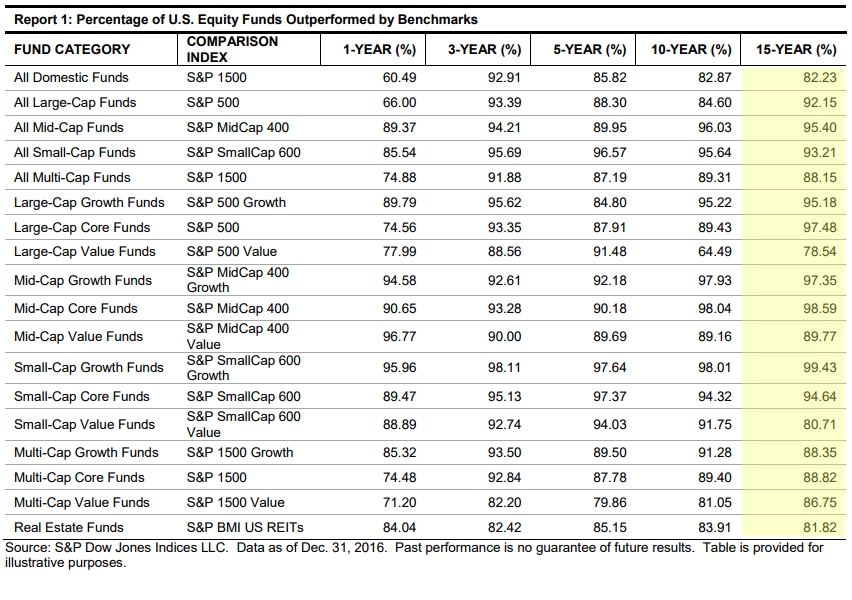
- Over the 15-year period ending Dec. 2016, 92.15% of large-cap, 95.4% of mid-cap, and 93.21% of small-cap managers trailed their respective benchmarks.
- Across all time horizons, the majority of managers across all international equity categories underperformed their benchmarks.
I’ve also provided a table below, which breaks down performance by relevant benchmarks. I’ve highlighted the 15-year column to make it easier to read:
As you can see, over the long term the vast majority of active managers lost to their respective benchmarks. Even the best performing active categories still lost to the benchmark about 80% of the time over the past fifteen years.
If you change the timeframe, you’ll notice that active management sometimes performs better, sometimes worse. However, over no time period in the current dataset did active management do any better than random chance.
What about risk?
Interestingly, the SPIVA scorecard only tells us the return side of the equation. Risk is also important. For example, if a manager underperformed the S&P 500 but did so at less than half of the risk of the index, that fund might have a superior risk/return combination. (A common argument active managers often make is that, while they may lose to the index in a bull market, active management provides “downside protection”, i.e., in a down market some amount of active buying and selling can reduce losses).
But there are also risks to active management. In my next piece I’ll delve into this idea more fully. We’ll review the relevant academic and market data to test the hypothesis that active management is less risky than passive investing.
Frank Napolitano is a Senior Financial Advisor and CERTIFIED FINANCIAL PLANNERTM. To speak with Frank or another member of our team about your financial future, get in touch today.

