

You may have noticed that the stocks of a small number of large companies have great impact on the performance of the stock market. I did an Internet search on “5 stocks dominate” and found a very large number of articles discussing the “unprecedented” share of the “FAANG” stocks (Facebook, Apple, Amazon, Netflix, Google) in total market capitalization. The grouping of “dominant” stocks is elastic, sometimes including Microsoft and Tesla.
You might wonder if the world has changed. Does diversification still make sense if a handful of companies make up such are large share of the overall market? Perhaps investing success simply requires purchasing the top 5 or ten stocks.
How has diversification performed historically?
Just in the nick of time, Hendrik Bessembinder’s article, “Do Stocks Outperform Treasury Bills?” in the Journal of Financial Economics, rides to the rescue. Bessembinder’s research provides long-term perspective on this question. Here’s a sneak preview – diversification is still the best strategy for all but the most risk-loving investors.
The paper analyzes the returns of every US stock represented in the University of Chicago’s Center for Research in Security Prices (CRSP) database from 1926 to 2016 – 90 years and 25,967 stocks. That adds up to 3,565,216 months of stock performance!
The paper compares the performance of each stock, each month, to the performance of Treasury bills in that same month. Treasury bills are effectively the risk-free US asset. The headline finding is that, while on average, stocks outperform Treasury bills, more often than not, individual stocks underperform both Treasury bills and the stock market index.
That sounds like an internally contradictory statement. Understanding it requires a brief digression into some simple statistical ideas. Stay with me – they are easy to understand.
Suppose we have 3 stocks, A, B and C. During January, A loses 30%, B returns 0%, and C returns 30%.
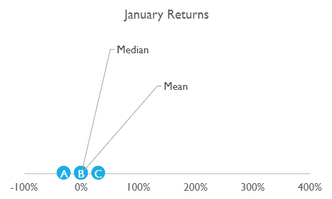
B’s return of 0% is also the median or middle return (marker for median return is hidden behind B). The mean or average return is the sum of all the returns divided by the number of stocks. That’s -30% plus 0% plus 30% or 0% divided by 3, which is 0% (also the same as B’s return, thus the marker is hidden behind B). In January, the mean or average return equals the median or middle return.
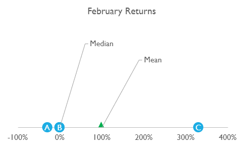
In February, A again loses 30% (poor A!), B breaks even at 0%, and C has a barnburner month, gaining 330%. The median (middle) return for the month is still B’s 0% (again, the marker is hidden behind B), but the mean (average) is the total of all three returns, -30% + 0% + 330% = 300%, divided by 3 – that’s 100% (green triangle in the chart). The mean is larger than the median. When the mean is larger than the median, the distribution is said to be skewed to the right. That basically means that the distribution isn’t symmetrical (like a “bell curve”). There are a few very large positive returns (like C’s in February). Most returns are much smaller (like A’s and B’s).
Now, what return would investors receive? Investors buying all three stocks would receive the mean return. Investors buying just one stock might get any of the three returns. If we consider a more realistic situation with many stocks, and a return distribution skewed to the right, the number of stocks earning large returns will be small. Investors buying just one stock will have only a small chance of earning those large returns (half of these investors will receive the median return or less).
Effectively, Bessembinder finds the distribution of individual stock returns skews to the right, and it is more skewed for longer time periods. The median stock return is close to the T-Bill rate. Most investors holding individual stocks, in many months, would do better with the risk-free investment.
Value creation is concentrated, too
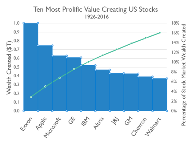
Historically, the stocks that performed best did very, very well indeed (see chart above). The top ten stocks (out of 25,967, remember) generated 16% of all the economic value (return over Treasury bill returns) created by the US stock market between 1926 and 2016. The green curve shows the cumulative percentage of value created by the listed stocks from largest (Exxon) to number 10 (Walmart). You probably recognize the names of the stocks. We’re not finished yet, though. The top 90 stocks (.36%) account for half the value created, and the top 1,092 (4.31%) contributed all of it. The remaining 24,000 or so, the remaining 95+% (!), collectively contributed nothing. Their investors would have done just as well owning Treasury bills and taking no risk.
What should investors do?
Bessembinder also investigated investment approaches to determine how their returns compared to that of the stock market overall, or the index. He constructed five different approaches based on the number of stocks each held, from 1 stock to 100 stocks, over different time frames, from 1 year to 90 years. For each portfolio size, he constructs a new portfolio each month, selecting from 1 stock to 100 stocks at random. He constructs 20,000 portfolio paths for each strategy and each time frame. The chart shows the percentage of paths that beat the index for each approach.
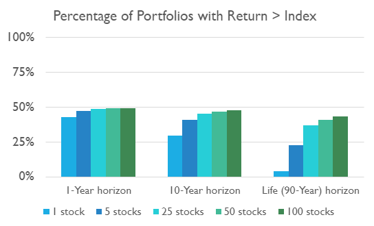
The concentrated strategies can beat the index, but it’s hard! Larger portfolios are more likely than smaller ones to be successful, and all approaches are less likely to be successful the longer the time frame. Even 100-stock portfolios beat the index less than 50% of the time. [You might argue that a talented stock-picker would do better than randomly choosing stocks – a long sequence of Wall Street Journal articles about highly regarded stock pickers losing to darts thrown at the stock pages would suggest otherwise.]
The mean returns for 1- and 5-stock portfolios are much larger than the median, and much larger than the index returns, and the advantages are larger for the longer time frames. However, the return distributions are very skewed to the right, and the chance of beating the index is very small.
In short, it was ever thus. Since the 1920s, a small number of stocks have contributed most of the market’s investment returns. However, it has always been very difficult to know, in advance, which ones will contribute the most. A broadly diversified index approach, holding all stocks in proportion to their share of market value, ensures that investors will hold the small number of stocks that deliver very large returns, while more concentrated approaches do not. Investors who are willing to accept a large chance of losing most of their investment by investing in concentrated portfolios can be very successful, but most are likely to be disappointed.
This article originally appeared in Forbes.com.
Photo by Karen Vardazaryan on Unsplash